by admin | Aug 29, 2013 | Infographics, Productive Boredom
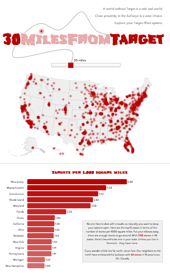
If you’re not big on reading and just want to see pretty pictures, go here first. If it looks interesting, read on. It’s no secret to those who know me that I have a great love of Target. My criteria for places to live includes a “30 minutes from Target” clause, henceforth known as 30MFT. I also happen to think that interactive maps are cool. These two seemingly unrelated facts provided a golden opportunity: figure out how to make cool, interactive maps AND discover what parts of the country I am eliminating with 30MFT. This was the perfect project to try out D3.js, a javascript library that mixes SVG, HTML, and CSS. D3 has been used to make countless infographics, such as the ever popular choropleth map and I wanted to give it a try. Here’s how the process went for creating this highly useful infographic: Step 1: Download (or link to) D3 and jquery. Easy, right? Step 2: Create a basic html template to hold all the forthcoming javascript goodness, with a side of CSS. Step 3: Read a couple tutorials on getting started with D3 (see links below), get acquainted with the power of d3.select and d3.selectAll, type a few lines of code, and see a beautiful purple circle on your screen. Ok, so maybe your circle isn’t purple and maybe it’s not even a circle, but the point is that you get something to appear on screen, nicely wrapped in SVG tags. Step 4: Think to yourself, this is going to be a piece of cake. Now to find a map. Step 5: Do a little...
by admin | Aug 22, 2013 | Productive Boredom
This project is the result of a failed attempt to do something with an API that turned into a successful attempt to do something different with the same API. Still with me? Ok, good. My original plan was to have some fun with a thesaurus API. Although I quickly lost interest in my initial idea (too complicated), I decided to salvage the thesaurus portion and use it in a slightly scaled down, uber pointless project. Above the radio buttons where it says “Make my…”, the word “boring” (“dull” in the screenshot above) is replaced with synonyms that cycle through every few seconds. I used the BigHugeLabs Thesaurus API to dynamically generate the list of words. The list of synonyms is a combination of all “boring” synonyms, all synonyms of a randomly selected “boring” synonym, and all synonyms of the randomly selected “boring” synonym synonym. Now my mission to set the record for most uses of the word “synonym” in a single paragraph is complete. Moving on, there are four things you can do to your text. 1. Get rid of some vowels, add a little extra punctuation, and just generally bastardize the spelling. 2. Make it ready for Twitter. 3. Pig Latin for the 21st century. 4. Polish it off with a nice, shiny Boston accent. If you don’t follow directions, I’ll let you know. And if you can’t find the button, promptly make an appointment with your eye doctor. Once I had all the API stuff working (looking up synonyms), I wanted to cram in a few more things. Up first was getting rid of ugly default radio...


Recent Comments