
If you are expecting an amazing resource that will shed light on all things chart-related, you clearly don’t know me. If you want to be mildly entertained while getting a glimpse of the charting possibilities of D3.js, you’re in the right place. If you want to see the final result without reading the rest of this post, I’ll forgive you.
Having used D3 for a couple other projects, I knew it could do cool things. This time I wanted to try a bunch of different charts for a broader view of D3. As a bonus, I thought I’d try some animated transitions, because what’s better than a plain old chart? A chart that moves, of course!
The Setup
I used the awesome fullPage.js to set up the project, with one chart per page. The documentation for fullPage.js is great and it’s incredibly easy to get something up and running. There were even examples of the type of side navigation I wanted (I’m a sucker for examples).
Since I didn’t have any actual data to plot, I was able to get a bit creative and finesse the data to get the look I wanted. So much power, so little time.
It Moves!
For charts in the wild, animation should be used sparingly. For my little Frankenstein charts, though, anything goes (mwah ha ha ha). I used animations and transitions left and right just to see what I could conjure up. After all, the best way to learn about D3 transitions is to try them, right?
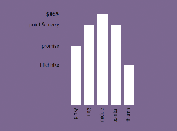
Bar Chart
The bar chart didn’t take much work because I had made them before. In this case I chose to make a particularly useless version. If you’re looking for some bar chart examples, these are great resources:
- Let’s Make a Bar Chart (Mike Bostock)
- A Bar Chart, Part 2 (Mike Bostock)
- Making a Bar Chart (Scott Murray)
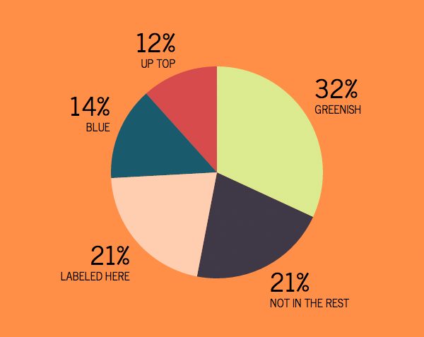
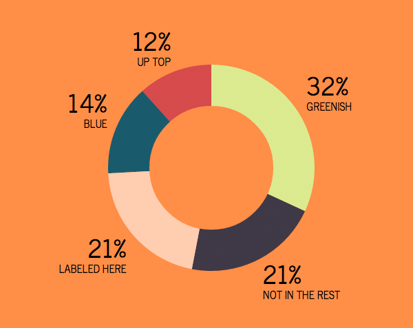
Pastry Charts (Pies and Donuts)
Making the pie chart was pretty simple thanks to this example. Getting it to animate the way I wanted, not so simple. The animation I ended up with was a bit of a happy accident after using the animation from the example and playing with timing and opacity, but it works.
With the donut chart, I actually cheated a little. Normally a donut chart is a pie chart with a non-zero inner radius. That worked until I decided to animate the inner radius (transition from the pie to the donut).
After a few unsuccessful attempts to animate the inner radius (with some truly wonky results), I took a shortcut. I added a circle with the same lovely shade of orange as the background and the same center point as the pie chart. Then I animated the circle from a radius of 0 to a larger value, effectively making the hole in the middle of the donut grow. It’s certainly not the best method, but it got the job done.
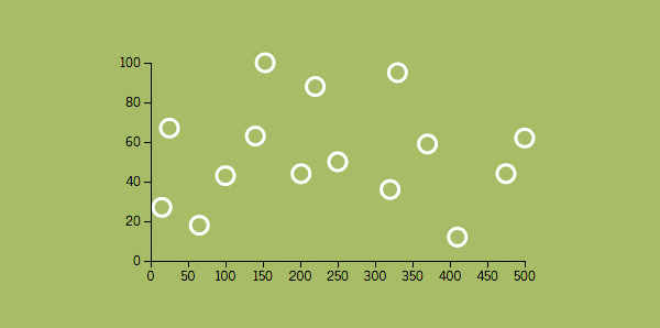
Scatter Plot
The scatter plot was fairly simple. Plot a bunch of points, and done. I tried a few ideas for animation, but in the end having the dots appear one at a time had the best effect.
One lesson learned: If you are using .ease(‘elastic’), to shrink a data point (i.e. decreasing the radius), make sure you’re not ending at 0. The ‘elastic’ transition animates past the end point, resulting in a negative radius and some very angry code. If you do need to end at 0, ‘bounce’ has a similar effect without going negative.
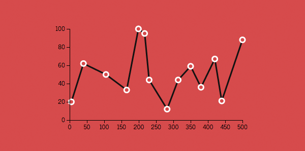
Line Graph
The line graph was simple to create, and of course animating from point to point was equally simple. Ha! Not quite. It turns out animating from point A to B is not that straightforward and requires a bit of a hack (although a very commonly used hack). You make the line a dashed line, with really big dashes (stroke-dasharray). Then you animate the dash offset (stroke-dashoffset), or the space between the gigantic dashes. The result is a line being drawn on the screen. Rejoice!
Venn Diagram
I thought the Venn diagram would be the easiest because, well, it’s three circles. There’s even a D3 example called Three Little Circles. And it was easy, until I realized that I actually needed to separate the circles into overlapping regions so I could hover over each section separately (oh goody).
Enter clip paths. This handy example, again from Mike Bostock, does a good job illustrating the basic idea. In short, you create your three circles as clip paths instead of normal circles. Then for each venn diagram segment, create a rectangle and combine the clip paths as needed to get the desired segment.

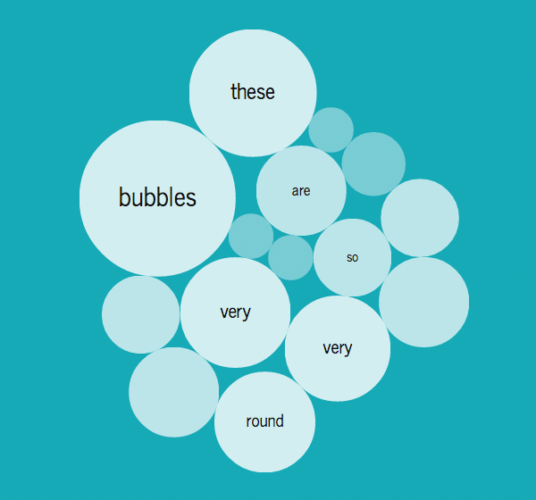
Bubbles!
There wasn’t much to the bubble chart because I took what I had done for Alphabet Cities and changed some values to get the look I wanted. Gotta love copy/paste (with appropriate credit, of course).
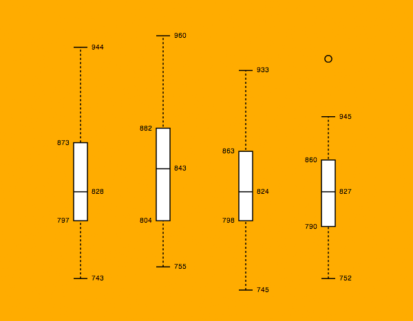
Box Plot
For the box plot, I used code from Mike Bostock’s box plot example. I adjusted some of the values to get the look I wanted, but other than that it was straight-up code re-use.
Quick tip for testing ajax-y stuff (like importing the csv data for the box plot example): If you’re working locally and trying to use Chrome (and some other browsers), you might see this lovely error:
XMLHttpRequest cannot load [insert file name here]. No ‘Access-Control-Allow-Origin’ header is present on the requested resource. Origin ‘file://’ is therefore not allowed access.
Luckily it’s a quick fix.
1. Close the browser.
2. Open up Terminal (or the console on Windows).
3. On a Mac, type “open /Applications/Google\ Chrome.app –args –allow-file-access-from-files” without the quotes. For Windows the string is probably similar and a quick search should find what you need. The browser will open and you can proceed error free.
Other Resources
- Lettering.js: plugin used to break words into individual letters to style separately (used on the title slide)
Recent Comments