by admin | Sep 2, 2013 | Infographics, Productive Boredom
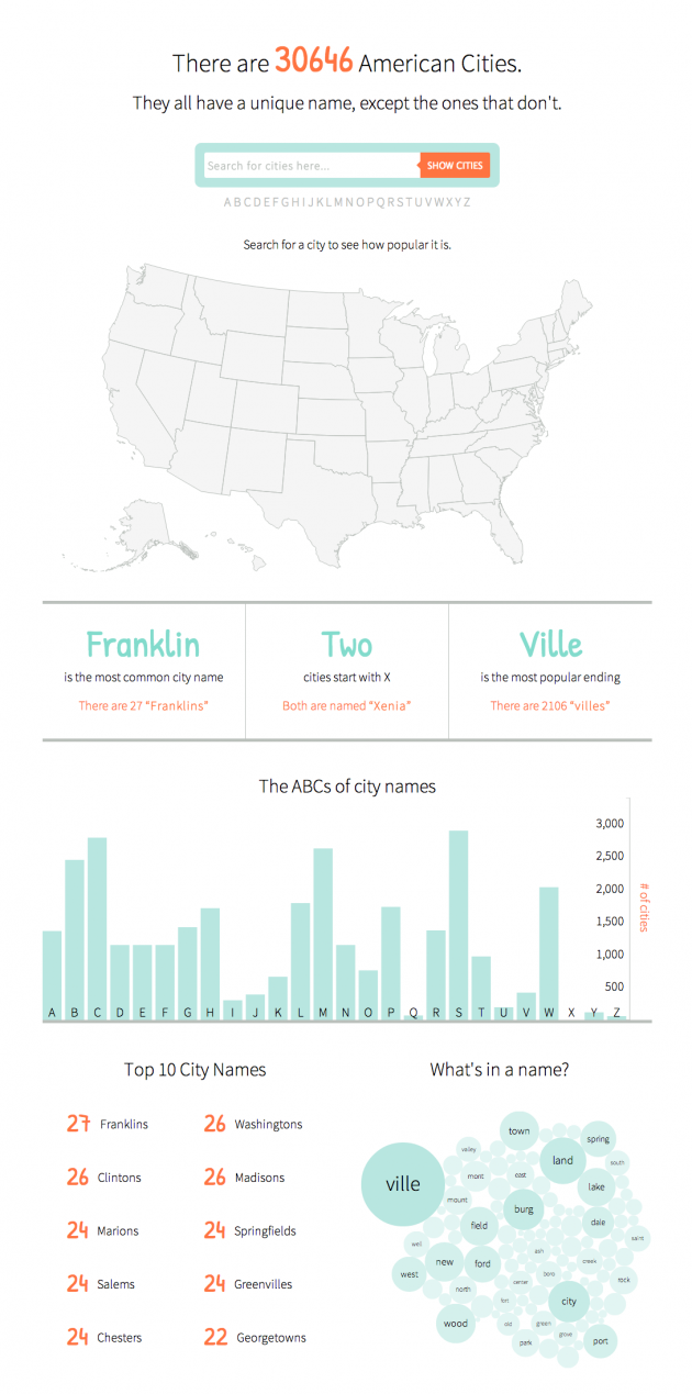
The final infographic can be seen here. If you’ve ever lived in New England you know that while the region is quite creative with the pronunciation of city names, it’s conspicuously uncreative when it comes to selecting names in the first place. Cities named Manchester, Concord, and Salem (among others) run rampant in the region. That got me thinking, “Is this purely a New England thing?” I smell a side project. Having recently discovered the power of D3.js and how easy it is to create an interactive map, I wanted to see what else I could throw together. Up first was the map – basically the same as the Target map. Next I downloaded city data from GeoNames, removed a pesky entry for Wake Island that is not in the U.S., and processed the text file for later use. To make the map interactive, I added a search bar and used a little jquery to take the search input and plot matching cities. Typing in a word searches for that word anywhere in the city name. Put it in quotes and it will search for an exact match. If you search for a single letter, it finds cities that start with that letter. Next I processed the data to find some basic stats, like the top 10 city names and the number of cities starting with each letter of the alphabet. Finally, a bubble chart showing common words in city names and some handy tooltips to finish it off. It’s worth noting that there are some cities missing. A search for “shaker” (without the quotes) brings up no results,...
by admin | Aug 29, 2013 | Infographics, Productive Boredom
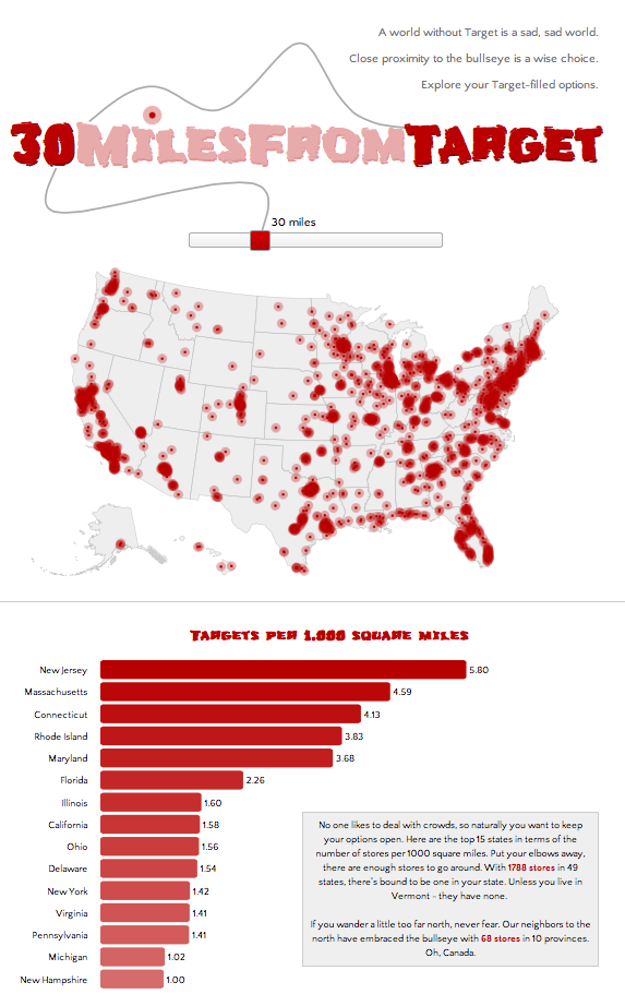
If you’re not big on reading and just want to see pretty pictures, go here first. If it looks interesting, read on. It’s no secret to those who know me that I have a great love of Target. My criteria for places to live includes a “30 minutes from Target” clause, henceforth known as 30MFT. I also happen to think that interactive maps are cool. These two seemingly unrelated facts provided a golden opportunity: figure out how to make cool, interactive maps AND discover what parts of the country I am eliminating with 30MFT. This was the perfect project to try out D3.js, a javascript library that mixes SVG, HTML, and CSS. D3 has been used to make countless infographics, such as the ever popular choropleth map and I wanted to give it a try. Here’s how the process went for creating this highly useful infographic: Step 1: Download (or link to) D3 and jquery. Easy, right? Step 2: Create a basic html template to hold all the forthcoming javascript goodness, with a side of CSS. Step 3: Read a couple tutorials on getting started with D3 (see links below), get acquainted with the power of d3.select and d3.selectAll, type a few lines of code, and see a beautiful purple circle on your screen. Ok, so maybe your circle isn’t purple and maybe it’s not even a circle, but the point is that you get something to appear on screen, nicely wrapped in SVG tags. Step 4: Think to yourself, this is going to be a piece of cake. Now to find a map. Step 5: Do a little...
Recent Comments