
by admin | Mar 30, 2014 | Productive Boredom
If you are expecting an amazing resource that will shed light on all things chart-related, you clearly don’t know me. If you want to be mildly entertained while getting a glimpse of the charting possibilities of D3.js, you’re in the right place. If you want to see the final result without reading the rest of this post, I’ll forgive you. Having used D3 for a couple other projects, I knew it could do cool things. This time I wanted to try a bunch of different charts for a broader view of D3. As a bonus, I thought I’d try some animated transitions, because what’s better than a plain old chart? A chart that moves, of course! The Setup I used the awesome fullPage.js to set up the project, with one chart per page. The documentation for fullPage.js is great and it’s incredibly easy to get something up and running. There were even examples of the type of side navigation I wanted (I’m a sucker for examples). Since I didn’t have any actual data to plot, I was able to get a bit creative and finesse the data to get the look I wanted. So much power, so little time. It Moves! For charts in the wild, animation should be used sparingly. For my little Frankenstein charts, though, anything goes (mwah ha ha ha). I used animations and transitions left and right just to see what I could conjure up. After all, the best way to learn about D3 transitions is to try them, right? Bar Chart The bar chart didn’t take much work because I had made them before....
by admin | Sep 2, 2013 | Infographics, Productive Boredom
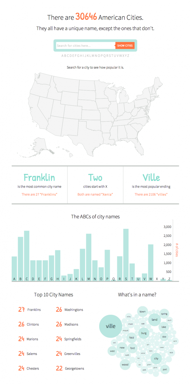
The final infographic can be seen here. If you’ve ever lived in New England you know that while the region is quite creative with the pronunciation of city names, it’s conspicuously uncreative when it comes to selecting names in the first place. Cities named Manchester, Concord, and Salem (among others) run rampant in the region. That got me thinking, “Is this purely a New England thing?” I smell a side project. Having recently discovered the power of D3.js and how easy it is to create an interactive map, I wanted to see what else I could throw together. Up first was the map – basically the same as the Target map. Next I downloaded city data from GeoNames, removed a pesky entry for Wake Island that is not in the U.S., and processed the text file for later use. To make the map interactive, I added a search bar and used a little jquery to take the search input and plot matching cities. Typing in a word searches for that word anywhere in the city name. Put it in quotes and it will search for an exact match. If you search for a single letter, it finds cities that start with that letter. Next I processed the data to find some basic stats, like the top 10 city names and the number of cities starting with each letter of the alphabet. Finally, a bubble chart showing common words in city names and some handy tooltips to finish it off. It’s worth noting that there are some cities missing. A search for “shaker” (without the quotes) brings up no results,...
by admin | Aug 29, 2013 | Infographics, Productive Boredom
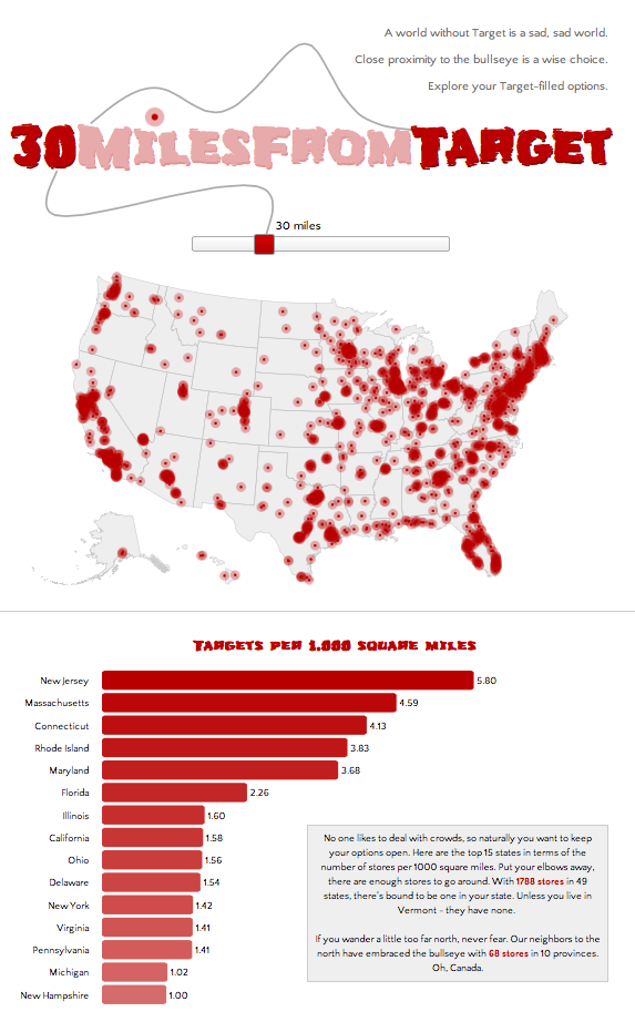
If you’re not big on reading and just want to see pretty pictures, go here first. If it looks interesting, read on. It’s no secret to those who know me that I have a great love of Target. My criteria for places to live includes a “30 minutes from Target” clause, henceforth known as 30MFT. I also happen to think that interactive maps are cool. These two seemingly unrelated facts provided a golden opportunity: figure out how to make cool, interactive maps AND discover what parts of the country I am eliminating with 30MFT. This was the perfect project to try out D3.js, a javascript library that mixes SVG, HTML, and CSS. D3 has been used to make countless infographics, such as the ever popular choropleth map and I wanted to give it a try. Here’s how the process went for creating this highly useful infographic: Step 1: Download (or link to) D3 and jquery. Easy, right? Step 2: Create a basic html template to hold all the forthcoming javascript goodness, with a side of CSS. Step 3: Read a couple tutorials on getting started with D3 (see links below), get acquainted with the power of d3.select and d3.selectAll, type a few lines of code, and see a beautiful purple circle on your screen. Ok, so maybe your circle isn’t purple and maybe it’s not even a circle, but the point is that you get something to appear on screen, nicely wrapped in SVG tags. Step 4: Think to yourself, this is going to be a piece of cake. Now to find a map. Step 5: Do a little...
by admin | Aug 22, 2013 | Productive Boredom
This project is the result of a failed attempt to do something with an API that turned into a successful attempt to do something different with the same API. Still with me? Ok, good. My original plan was to have some fun with a thesaurus API. Although I quickly lost interest in my initial idea (too complicated), I decided to salvage the thesaurus portion and use it in a slightly scaled down, uber pointless project. Above the radio buttons where it says “Make my…”, the word “boring” (“dull” in the screenshot above) is replaced with synonyms that cycle through every few seconds. I used the BigHugeLabs Thesaurus API to dynamically generate the list of words. The list of synonyms is a combination of all “boring” synonyms, all synonyms of a randomly selected “boring” synonym, and all synonyms of the randomly selected “boring” synonym synonym. Now my mission to set the record for most uses of the word “synonym” in a single paragraph is complete. Moving on, there are four things you can do to your text. 1. Get rid of some vowels, add a little extra punctuation, and just generally bastardize the spelling. 2. Make it ready for Twitter. 3. Pig Latin for the 21st century. 4. Polish it off with a nice, shiny Boston accent. If you don’t follow directions, I’ll let you know. And if you can’t find the button, promptly make an appointment with your eye doctor. Once I had all the API stuff working (looking up synonyms), I wanted to cram in a few more things. Up first was getting rid of ugly default radio...
by admin | Apr 23, 2013 | CAPITALS
With the conclusion of CAPITALS, it’s time to turn the caps lock off. To see all the capital squares together in one place without the awesome commentary (ha!), head on over here. I really didn’t think I’d get through all 50, but I couldn’t bring myself to leave some sorry capitals untouched. While completing this weird little project (something that will likely be a recurring theme on this blog), I learned a few things: 1. Not only does Christopher Columbus get his own holiday (albeit a barely recognized one), but he also has TWO state capitals named after him. That’s right…Columbus, Ohio and Columbia, South Carolina were both named after the directionally challenged explorer. 2. There are a lot of capitals. Of course I realize that there are 50 (something I was well aware of when I started), but it sure seemed like an especially large 50. The 50 states were so much easier to finish. 3. Bismarck has a “c” in it. This was truly shocking. As one of the 5 people outside of North Dakota who actually knew of the existence of Bismarck, I was floored when I realized I had been misspelling it all these years. Ok, it’s not like I actually write about Bismarck ever, but if I did I certainly would’ve misspelled it. I even had to triple check to verify that there is indeed a “c” buried in...
by admin | Apr 20, 2013 | CAPITALS
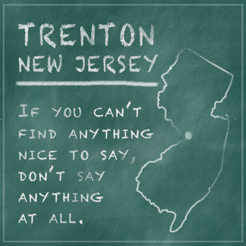
Last but not least, it’s time to tackle Trenton in the battle of the CAPITALS. I tried really hard to find something to say about Trenton, but it seems that the city could use a bit of a PR overhaul. Try searching for something that makes Trenton stand out. Let’s just say the results are not exactly stellar. So for now, I plead the...
Recent Comments